`<data:calendar>`
</...>
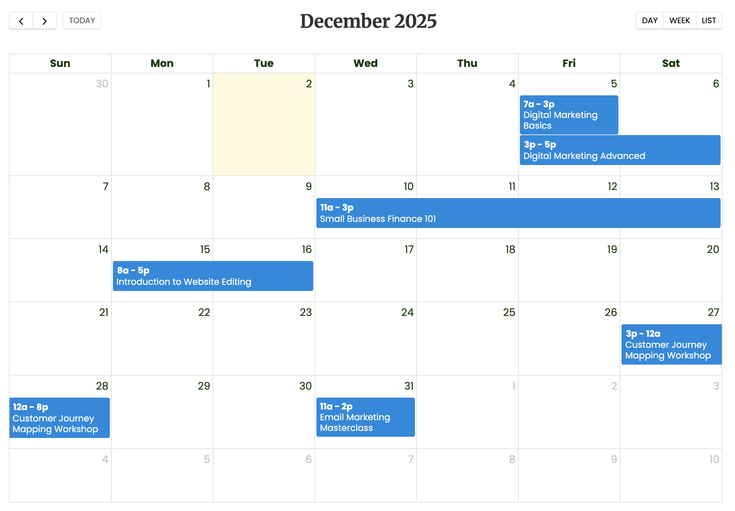
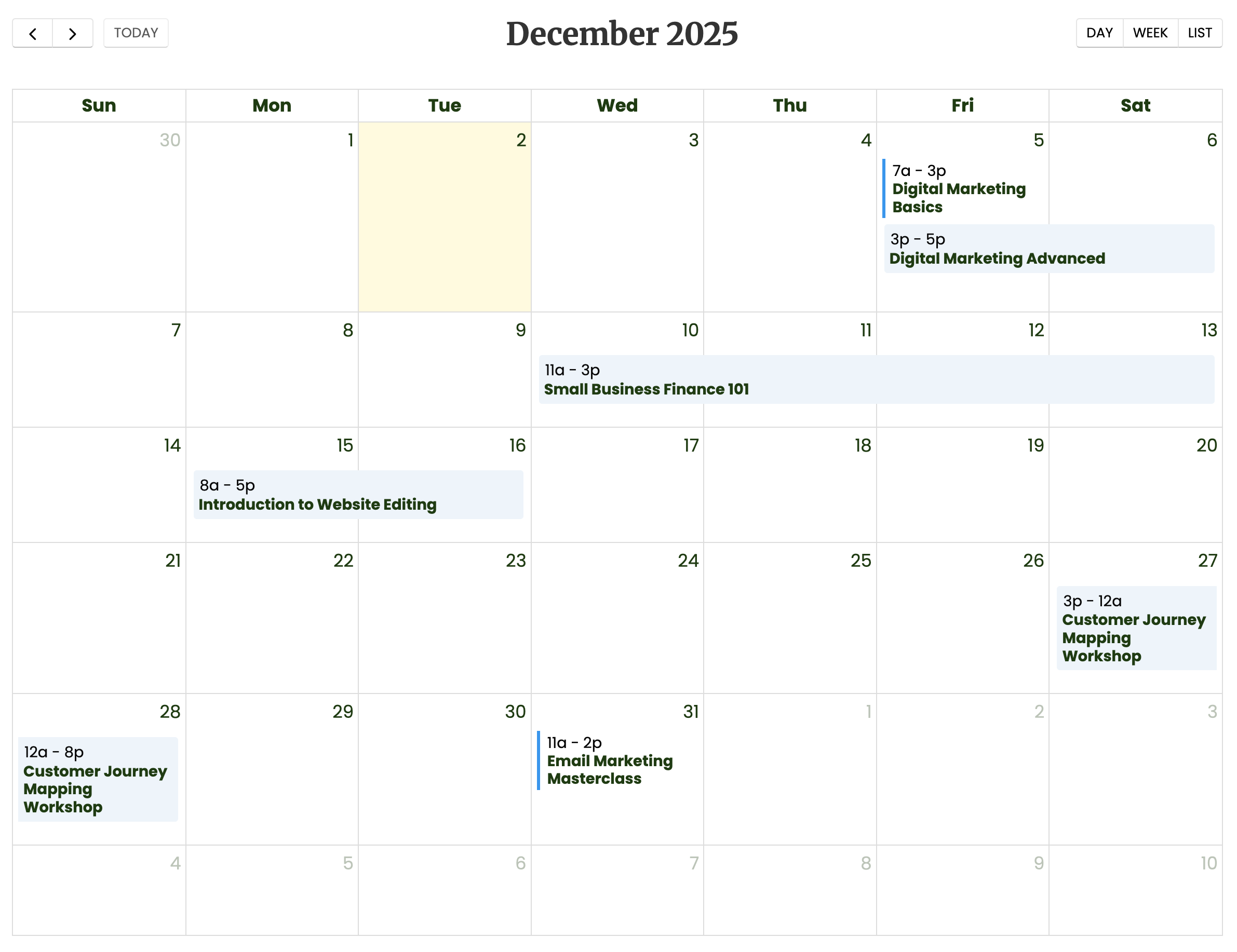
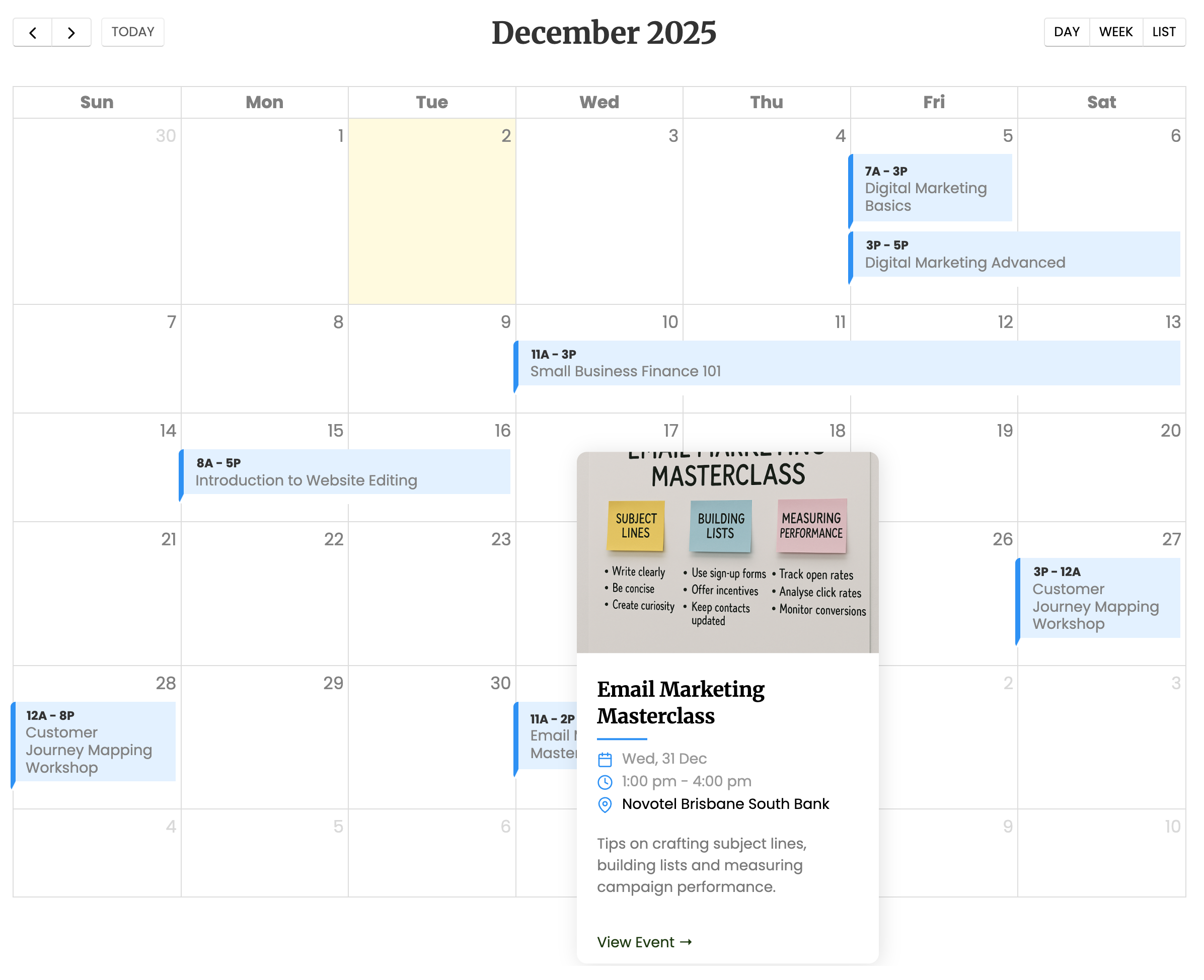
Creates a FullCalendar widget which can be used for displaying events over a period of time.
Related Tutorials
Content
any
The content inside the Calendar tag serves as a template for what is displayed inside each tile of the calendar.
Attributes
- `agendaAllDaySlot`
bool
Determines if the "all-day" slot is displayed at the top of the calendar.
When hidden with false, all-day events will not be displayed in agenda views.
- `allDayColumn`
bool
The column from the DataSource which defines if the event is shown in the “all-day” section.
If true the time text is not displayed with the event.
- `as`
string
The name of the variable to be registered for each row. For example, as="myvar" will let you reference $myvar inside the control.
- `displayEventTime`
bool
Whether or not to display the text for an event’s date/time.
- `endDateColumn`
string
The column from the DataSource which defines the end dates of the events
- `eventDidMount`
string
JS event 'eventDidMount'
- `eventRender`
string
JS event 'eventRender'
- `headerButtons`
string
Sets the header buttons on the right
'timeGridDay,timeGridWeek,listMonth'
- `height`
string
Height
Sets the height of the element. The default units are pixels. include the percentage symbol % to user percentage values.
- `id`
string
(Required) Give this control a unique id. Can be accessed in the client DOM (eg, document.getElementById('myid') or in the server DOM using [? $myid ?] or [? $('myid') ?]).
- `initialView`
string
The initial view when the calendar loads
Default value = dayGridMonth.
Possible values:
dayGridMonth,dayGridWeek,dayGridDay
timeGridWeek,timeGridDay
listYear,listMonth,listWeek,listDay
- `mobileInitialView`
string
The view to switch to when the viewport is mobile-sized (< 768px wide).
Applied automatically on page load, only when the resolved initial view is dayGridMonth and there is no saved view state. Pass an empty string to disable the mobile auto-switch entirely.
Default value = listMonth.
Possible values (same as InitialView):
dayGridMonth,dayGridWeek,dayGridDay
timeGridWeek,timeGridDay
listYear,listMonth,listWeek,listDay
- `noControls`
bool
Whether or not to show controls to change the date shown of the calendar
- `onEventDrop`
string
JS event 'EventDrop'
- `onEventResize`
string
JS event 'EventResize'
- `resourceTitle`
string
Full calendar resource title
- `resources`
string
Full calendar resource data
- `slotMaxTime`
int
Determines the first hour/time that will be displayed, even when the scrollbars have been scrolled all the way up.
This can be a number like 22 (which means 10pm), a string like '22:30' (which means 10:30pm) or a string like '10:30pm'.
- `slotMinTime`
int
Determines the first hour/time that will be displayed, even when the scrollbars have been scrolled all the way up.
This can be a number like 5 (which means 5am), a string like '5:30' (which means 5:30am) or a string like '5:30am'.
- `startDateColumn`
string
The column from the DataSource which defines the start dates of the events
- `timeFormat`
string
Controls how event times are displayed in the calendar. Accepts a preset keyword or a JSON-encoded FullCalendar format object.
Presets:
short — e.g. "8:30pm" (lowercase, no space — best for fixing the narrow-cell "8:30p" truncation)
lowercase — e.g. "8:30 pm" (lowercase, with space — more readable in wider cells)
24h — e.g. "20:30"
Any other string is parsed as JSON and passed to FullCalendar's eventTimeFormat option. Invalid JSON is ignored.
- `uRLColumn`
string
The column from the DataSource which defines an on click URL
- `width`
string
Width
Sets the width of the element. The default units are pixels. include the percentage symbol % to user percentage values.