
This tutorial will provide an overview of the common elements used to put together web forms, and walk through implementation of a basic enquiry form.
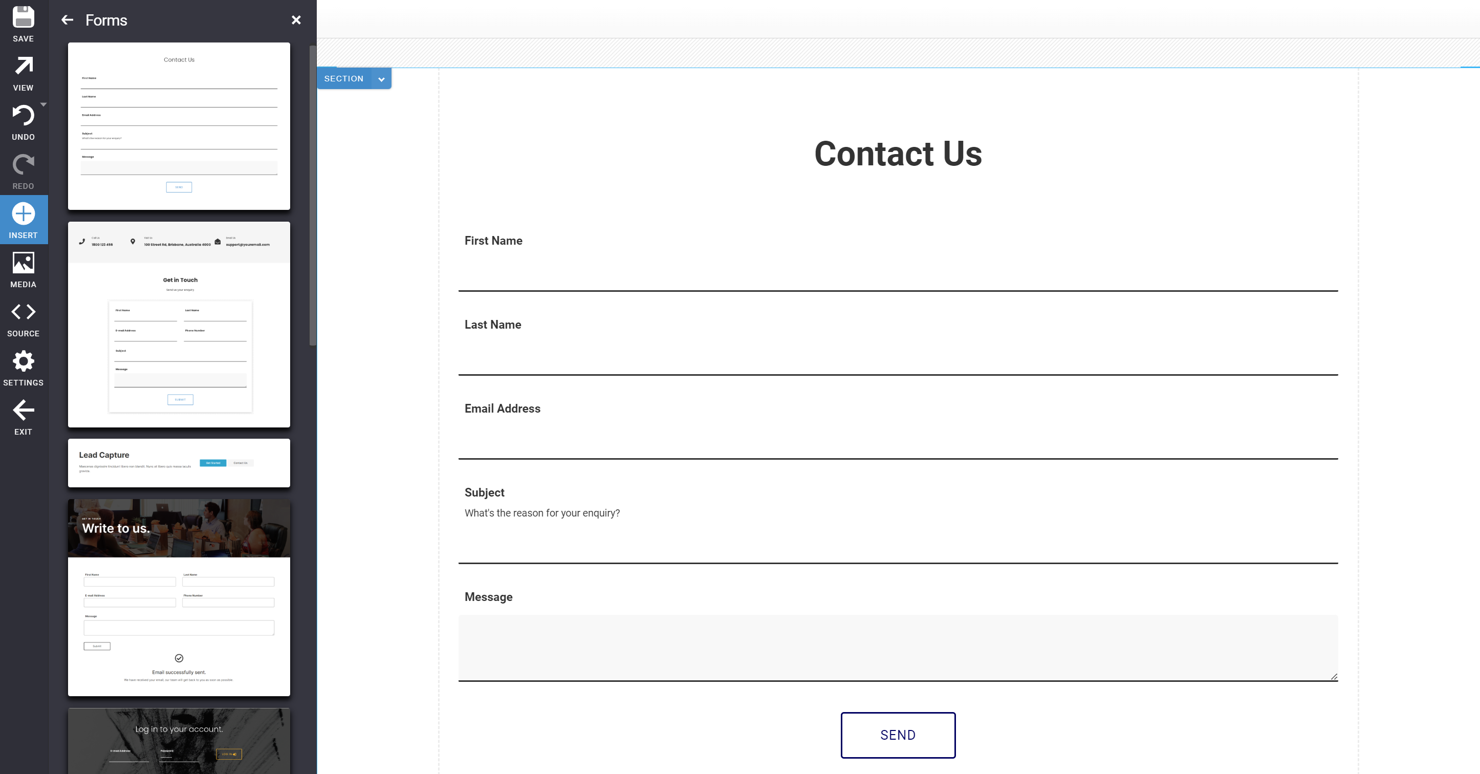
To get started building forms, it's also possible to add pre-built web forms to a page using Oncord's visual page editor. For more
information about Oncord's form builder, review this help article.
Examining the SRC code of example forms is a great way to familiarise yourself with common form elements.
The contact enquiry form shown below will:
1. Forward the user's form submission (contact enquiry) to a nominated admin email address.
2. Add the user as a new contact.
3. Redirect the user to a page confirming the form was submitted successfully.
The following UI controls seen in the example above are commonly used when implementing forms:
<forms:form>
This tag is used in place of a standard <form> tag, and introduces some additional options for handling a submission. Using this tag
will also introduce security and spam protection measures. When developing on the Oncord platform, the standard html <form> tag
should be replaced with the <forms:form> tag.
<forms:row>
A layout element used inside the <forms:form> tag to display a label and description, and ensures that form fields display nicely
when form submissions are emailed.
<forms:editbox>
Used in place of the standard html <input type="text"> field. A basic field that allows the user to input a single line of
text.
<forms:textarea>
Used in place of the standard html <textarea > field. Allows the user to enter multiple lines of text.
Options for handling a form submission are controlled by modifying / adding attributes to the <forms:form> tag. A list of common attributes can be found below.
You can also use any standard HTML form attributes (width, class, etc).
Id="contact_us"
Each form must be assigned a unique id. The form id is displayed throughout the Dashboard to log submissions, and when used with Automation.
Define an ID such as contact_us, quick_quote, get_started etc.
RecordSubmissions="true"
This attribute determines whether Oncord will store submissions from this form in the database. As an example; a contact form should
record submissions, whereas a simple login form or newsletter subscribe should not.
OnSubmitRedirect="/contact-us/success/"
This attribute defines the page users should be redirected to upon successful form submission. As standard practice, consider adding a new
page under the form to act as a success page.
ContactMode="store"
This attribute controls creation of the new contact. You may choose from the following valid values:
"Store" is commonly used for enquiry forms, otherwise use "register" when creating newsletter subscribe forms and "login" if you're implementing a login form.
OnSubmitEmail="info@mywebsite.com"
If set, a notification e-mail with the form submission details will be sent to the specified email address. You may separate multiple
e-mail addresses with a comma. When set to "true", the email address associated with the Oncord account will be used (Dashboard >
Settings > My Account).
OnSubmitEmailSubject="[? 'Website Enquiry: ' + $subject.getValue() ?]"
The OnSubmitEmailSubject attribute defines the subject of the notification email. To make it easier to find notification emails in your
inbox, it's common practice to include the form name, and either the name of the user who completed the form, or a message subject.
The .getValue() function can be used to retrieve and pass form fields by their ID. In this example, the 'subject' field is being used. To use the contact name, this could be changed to: $contact_first_name.getValue().
Because this attribute isn't simple text and needs to be evaluated, the value has been placed inside [? ?].
Alternatively, you could just specify simple text:
OnSubmitEmailSubject="New Website Enquiry"
Click here to view the full API reference for the <forms:form> tag.
Form rows are an optional layout element to provide an easy way for you to layout forms.
This tag renders a row, field label and description, and ensures that the form fields display properly when being emailed.
The row tag has the following commonly used attributes:
Label="Phone Number"
This attribute is used to define the text which will appear as the row label.
Description="Please enter your phone number"
This attribute places a short description in a small font.
Type="one_column"
This attribute defines the number of columns assigned to the row:
An <forms:editbox> allows the user to input one line of text, and a <forms:textarea> allows the user to input multiple lines of text.
If your form will create a new contact record in the database, each form field should use ids that match the contact database fields. (eg. use contact_first_name, contact_e-mail). You can view all contact fields here via the API reference.
The only form field types needed for a basic contact form were the editbox and the textarea, however other form field types are also available for use (check out the API).
The editbox has the following commonly used attributes:
Id="contact_first_name"
Each field must have a unique ID. If the current user is logged in, this will also allow the form to be prefilled with contact's details.
Validations="mandatory"
Sets the validations to be applied to the form item. In this case the editbox has a mandatory validation, which means the form will not
submit until the user has completed this field
Demonstrates a edit box with validation
HTML: