
-
Website
-
3min Explainer Walkthrough

- Generate a Design
-
Page Management

-
Page Editing

-
Form Builder

- Updating Your Navigation Menu
- Creating Page Redirectors
- Posts Management
-
Search Engine Optimization

- Setting Up Google Marketing Tools
- Setting Up Meta Pixel & E-commerce Tracking
- Setting Up Microsoft Marketing Tools
- Setting Up Linkedin Insight Tag
- Optimizing Images For Web
-
Analytics

- Third Party Embed Code
- Special Files
-
3min Explainer Walkthrough
- Contacts
- Marketing
- Commerce
- Apps
-
Settings and Config
- Going Live
- Billing
- Domain Health Checker
- Managing Administrators
- Registering a Domain Name
- Changing Your Domain Name
- The Role of DNS Records Explained
- Backing Up Your Website
- Choosing an E-mail Host
- Hosting Email With Oncord
- Setting Up Gmail Hosting
- Setting Up Microsoft 365 E-mail Hosting
- Setting Up Sub Domains
- Hosting a Sub-Site
- Changes
Sales Statistics
Understanding your sales performance is crucial for making smart business decisions. Oncord makes this process seamless with built-in Sales Statistics tool.
No plugins required, no third-party integrations. Whether you’re a small business owner, a web agency, or a digital marketer, it provides the clarity you need to optimise marketing, inventory, and strategy.
In this tutorial, we’ll show you how to access the Sales Statistics dashboard in Oncord, highlighting how to use its data visualisation and breakdowns to fuel your growth.
Access Sales Statistics
To get started:
- Login to your Oncord dashboard.
- Navigate to Commerce > Sales.
- Click the "Statistics" button at the top of the page.
You’ll now see an intuitive dashboard filled with data-driven insights from your store.
What You Can See in the Sales Statistics
Oncord’s statistics dashboard gives you a complete overview of your sales over a selected date range. You can toggle between Week, Month, Year, or Financial Year, then select the range using the date picker.
Below is a snapshot of key sales metrics:
- Sales: Total number of transactions.
- Total AUD: Gross revenue for the selected period.
- Avg AUD: Average order value.
- Tax AUD: Total tax collected.
- Shipping AUD: Shipping revenue collected.
- Discounts AUD: Total value of discounts applied.
These figures update dynamically based on the selected date range.
When you select a metric on the left, an interactive line graph appears on the right showing performance over time for that specific metric.
Notable marketing events like email campaigns, blog posts, conferences, or Facebook ads are annotated directly on the graph, making it easy to correlate promotions with sales spikes.
This is especially valuable for businesses running multichannel campaigns, helping you identify what works and when.
Comparison indicators
Analytics includes a comparison indicator for key metrics.
The comparison shows how each metric has changed compared to the previous period of the same length as the currently selected date range.
For example:
- If you are viewing the last 30 days, the comparison is against the previous 30 days
- If you are viewing a week, the comparison is against the previous week
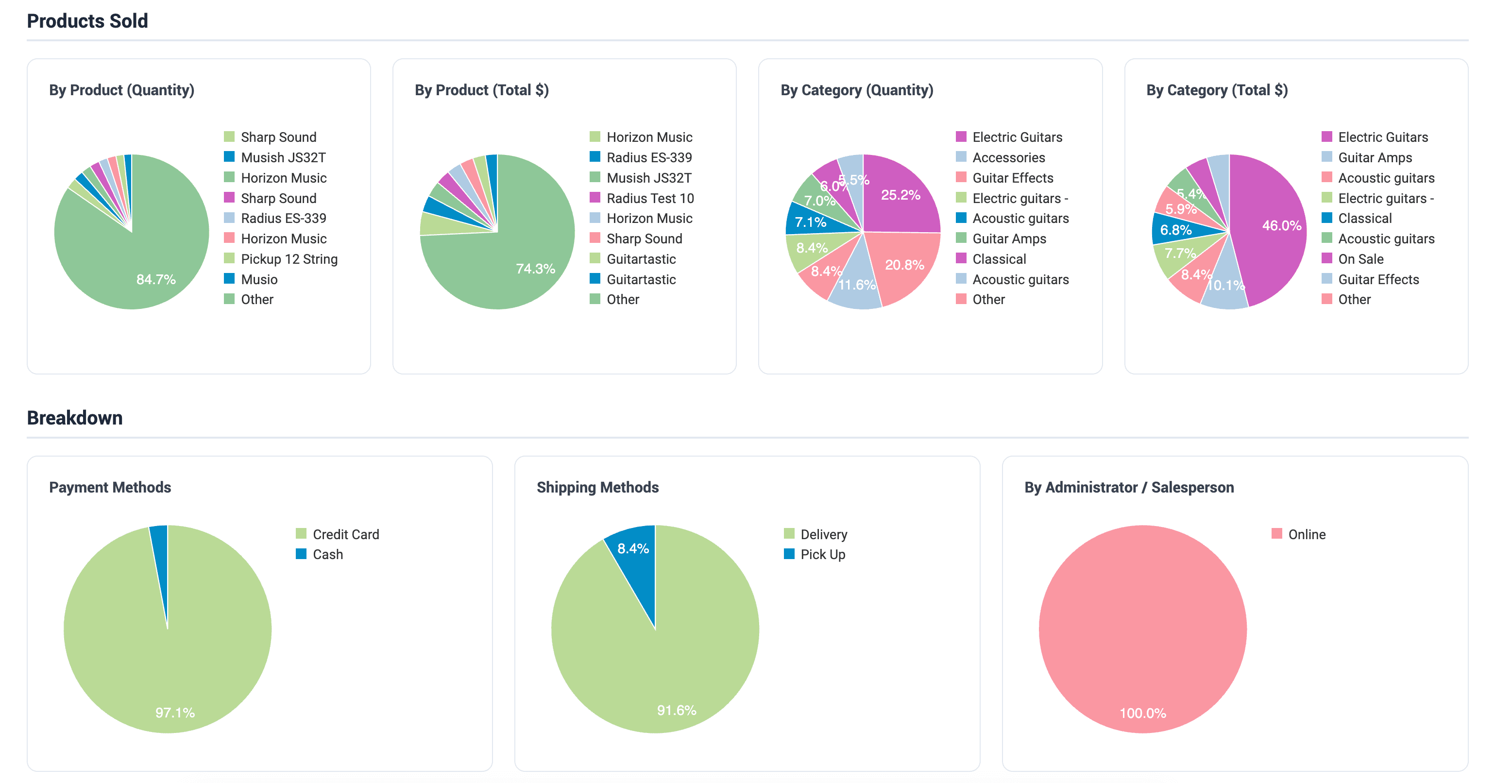
The lower half of the dashboard breaks sales down by:
- Product (Quantity and Total $): Identify best-selling products by volume and revenue.
- Category (Quantity and Total $): Understand which product categories drive sales.
- Payment Methods: Know how customers are transacting such as credit card, cash, or other.
- Shipping Methods: Understand how orders are being fulfilled, such as delivery or pickup.
- Sales by Administrator/Salesperson: Track performance per sales rep.
This helps you make informed decisions on inventory, promotions, and marketing focus, all from one unified view.
Custom Filter
You can use Custom Filter to narrow down sales analytics based on specific conditions.This helps you analyse performance by product, customer, channel, or campaign without exporting data or using third-party tools.
The Custom Filter field supports multiple conditions. You can:
- Search for a condition by typing
- Select one or more conditions
- Combine conditions using AND/OR logic
Once applied, only sales matching the selected criteria are included in the analytics.
Available Filter Options Include
- Contains Product
- Contains Product in Category
- Contains Product under Brand
- Created by Recurring Sale
- Sold by Administrator
- Sold online
- Sold to Contact
- Sold to Contacts in Group
- Total value
- Using discount
- Website – Analytics Referrer